 |
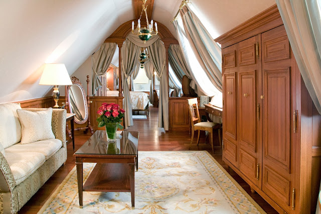
| Charles Jouffre – A little ‘Je ne sais quoi’ |
Let’s be real; when regal isn’t done right, it looks tacky. How many times have we seen regal looking designs which give the impression that the owner is trying too hard. Regal can’t be pulled off easily, but regal can be done right, so let’s have a look at some examples of where regal has been done right in our 10 Palace Inspired Home Inspirations.
1. Vittoria Orlandi: A Touch of Italian
Cream textile upholstery with golden (painted) fittings. Italian bedroom manufacturer Vittoria Orlandi has created this classic set, which boasts the wonderful fact that every piece is hand crafted. The set includes a double bed, two dressers, a bedside table, chair and pouf. As each set is handmade, there is also the choice of finishes to the bed headboard, chair and pouf upholstery.  |
| Vittoria Orlandi Design |
Purple’s, gold’s and cream’s, this really is the essence of what a regal room is meant to be. The blend of these colors is a tried and tested color palette.
 |
| Vittoria Orlandi Designs – Bedside Table |
 |
| Vittoria Orlandi Designs – Foot of Bed |
2. Vittoria Orlandi: Gold
Vittoria Orlandi’s brings you an elegant and ornate gold bed, matched by opulent period lampstands. The combination of the bed’s artistic framework and the beautiful eye catching tapestry and design of the bed cover provides us with a breathtaking beautiful and desirable furniture piece which would be the choice of any Lord or Lady’s master bedroom.  |
| Vittoria Orlandi Gold Design |
 |
| Vittoria Orlandi Gold Foot of Bed |
 |
| Gold Theme Continues with Gold Lampshade |
3. Attractive ‘Je ne sais quois’
Interior designer Charles Jouffre has encapsulated what this post is all about; taking an ordinary room and turning it into something extraordinary, something regal: Something special. Charles Jouffre’s design portfolio is broad, creating fresh designs in hotels, boutiques, residential and more. The designs below are some of his ideas that have come to life.  |
| Charles Jouffre Suite |
 |
| Charles Jouffre Living Room |
 |
| Charles Jouffre Bedroom |
4. Captivating Cream Curtains
The palace inspired focus here are the curtains. The way these soft cream curtains are tied back may be a little too much for the minimalist, but for those who like a bit of extra pizzazz and flare; this is definitely one to experiment with. The rich antique mauve colored walls help create the striking contrast that sets off these full length flowing cream curtains.
5. A Touch of Greece (Jennifer Lopez)
This bed looks like something pulled straight out of the Spartacus set, and even on a palace inspired scale it’s rather extravagant. The use of drapes around the bed is certainly eye catching, but this opulence could only be pulled off if you have the personality to match it.
The rooms design uses a mixture of gold and bronze colors with extravagant shapes and flowing curves as a feature in both the bed and side cabinet.
Guess who this bed belongs to: None other than Jennifer Lopez.
Source: View the making of this masterpiece in this video (sorry it’s not in English!)  |
| Custom Made Bed for Lopez |
6. Rest in Regal
Bedding drapes and chandeliers, with a traditional headboard; it screams royalty. The pastel yellow baroque wall paper and adjacent pastel yellow wall gives this room a very soft, soothing, traditional feel. A splash of lilac across the bed gives an immediate contrast to the heavy use of cream colors while tying the design together well with the curtains.  |
| Rest in Regal Beautiful Bed |
 |
| Classy Fainting Couch for When One Feels Faint |
 |
| With a Beautiful Ornate Fireplace… and a Flat Screen Television of Course |
7. Celine Dion’s Château
Who would have known that Celine Dion had a taste for Palace like opulence, but take a look at her house and you’ll see she hasn’t been conservative with what may well have been her childhood dream house. The house was up for sale last year in Quebec. So those of you who have a few extra pennies lying around, this is what you can get for $30 million Canadian dollars.  |
| Celine Dion’s Château |
 |
| Her ‘Living Quarters’ |
 |
| Classic dining room |
8. Charles Jouffre Continued
As Charles hits the nails on his head with his designs it would be silly not to show more of what this delicious designer has to offer.  |
| A perfect blend of creams folding back into each other, complemented by perfectly crafted regal chairs and curtains. |
 |
| See those shoes under the chair… dressing down any less than that in this room is an insult. |
Stunning purple color scheme among the chairs, curtains, vase, flowers, table top and lamp stand gives this room a rich vibrant atmosphere without going over the top and trying too hard. The purple marble table, topped with almost matching purple calla lilies is a wonderful touch.
9. Vittoria Orlandi: White
Vittoria shows us how regal is done again with her crisp white ideas transformed into reality in this gorgeous clean design with a hint of gold. Not every cloud has a silver lining but Vittoria nailed it as hers is lined with gold! This is a great example of how regal can look contemporary.  |
| Crisp and glistening: A design with a golden lining. |
 |
| Delightful delicate white rose petals on pillow attract the eye to something which is usually quite boring; There’s even a white (ceramic?) cacti on the bedside. |
 |
| Vittoria Orlandi’s White Inspired Design |
Heart shaped mirror, straight edged lamp shade, crisp and clean. One major drawback is maintaining this clean look for the years to come as grubby fingers and dust can taint a look like this fast. However, if you have this design yourself, you can probably afford a maid: Problem solved.
10. Uglyanitsa Alexander
Uglyanitsa Alexander has done a superb job capturing the essence of opulence in these regal designs. This house excels in its use of striking trims around each room whether through the use of strong gold colors or eye-catching textures and patterns. In fact, the use of such unique ceiling trims can bring continuity to the diverse design ideas throughout the different rooms.  |
| Where Old Meet’s New: Orignial Design, New Products |
 |
| Uglyanitsa Alexander’s Fresh Design |
The glossy marble or stone flooring helps to reflect the light which is a nice touch, bringing vitality and a freshness to the regal room. This is a refreshing contrast to the usual dim lighting and earthy tones which the palace inspired designs of Western Europe are dominated by. The blue drapes may not be everybody’s cup of tea, but they really do add the finishing touched to the room.
 |
| Michelangelo’s Hand of God Mural |
Michelangelo’s hand of God mural gives this living room a distinct Mediterranean feel. This room is just packed with detail upon detail in the gorgeous furniture, wall art and roofing decorations.
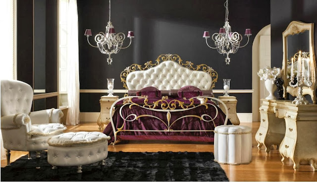
11. Vittoria: Beautiful Dark
Vittoria demonstrates how ornate and regal can come in many colors and styles. I love theblack murial on the wall which gives the illusion that a long extravagant hallway is just on the other side of the… bedside table!?!?! Maybe the illusion would have worked better if it weren’t obstructed by furniture, but who am I to take away from this delectable design.  |
| This design is encompassing both silver and gold. Some think classy, some think tacky. You decide. |
 |
| Upon closer view, we can see the floral designs in the headboard tapestry. |
 |
| Some will love it, some will loathe… |
12. Vittoria: Softly Does It
Sometimes soft works, and this is one instance of it. Nothing harsh, nothing brazen; just soothing. Earth tones throughout the room lends for a homely regal feeling. The arched window is a real feature in this room. This color scheme is timeless.  |
| Earth tones in curtains, floor and bed. |
 |
| It’s all about the detail |
 |
| A fresh touch to an old design |
http://fmiqed.blogspot.co.uk


0 komentar:
Posting Komentar